Light may be an ephemeral entity, a ceaseless rippling of intangible waves, but where so many people go wrong with their interior design is underestimating the degree by which light affects our perception of the tangible, more concrete elements of our decoration.If you want that artwork on the wall to pop, you have to formulate a lighting plan to facilitate said pop. If you want people to notice your stylish rug, you have to light the room accordingly.

If you want to create a chill, modern space for unwinding after a hard day’s work, you’ve guessed it… it all comes down to lighting (or mostly, anyway).That said, it can be hard to come up with a plan to do any of the above. We’re all just so obsessed with objects that it’s as if we can’t really get to grips with managing the ethereal, but not to worry.To help you tame these unruly wavelengths, I’ve composed this list of 10 stunning interior lighting ideas!
1. Vary The Altitude
Have you ever heard of light layering? Well, it primarily refers to using a mixture of different light types in a single space, but it can also have a more literal meaning, referring to the layering of fixtures in terms of height.The trick to creating a truly immersive and relaxing ambient light profile in a room is to station lights at different heights. We don’t normally think about this kind of thing, as, again, we’re all conditioned to like tangible stuff, so it often goes by the wayside. But, ironically, the most effective way of doing so begins with our stuff, as that’s largely going to provide the rise and fall of the room that we subsequently place lamps on, so it’s good to think about this from the very start of the decorating process.Using a combination of table lamps and long stem floor lamps is a fantastic way to approach height variation as the difference in design keeps the look as well as the light, fresh.
2. Twinsies!
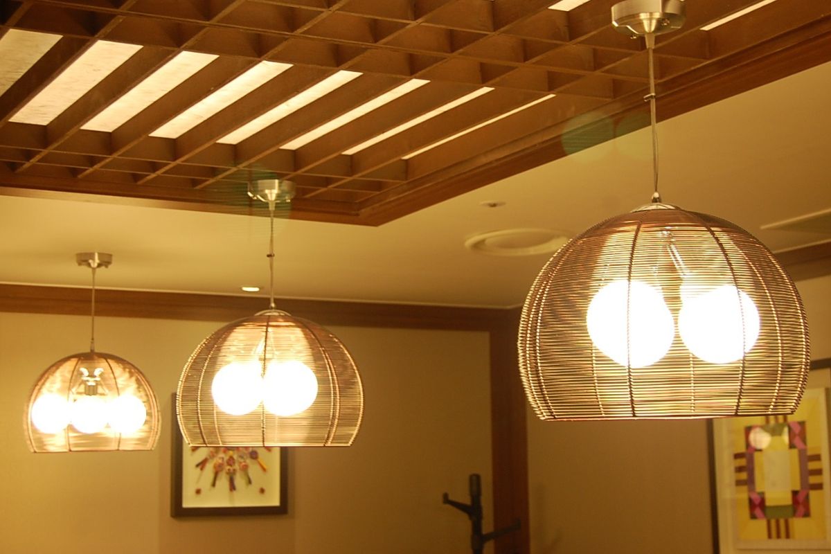
Rather than a single overhead for a space with a table, why not choose twin pendant lights to hang directly over this task-oriented zone of the room? Not only does it allow you to make more of a statement, two lights equal, well… more light, not to mention more even lighting.
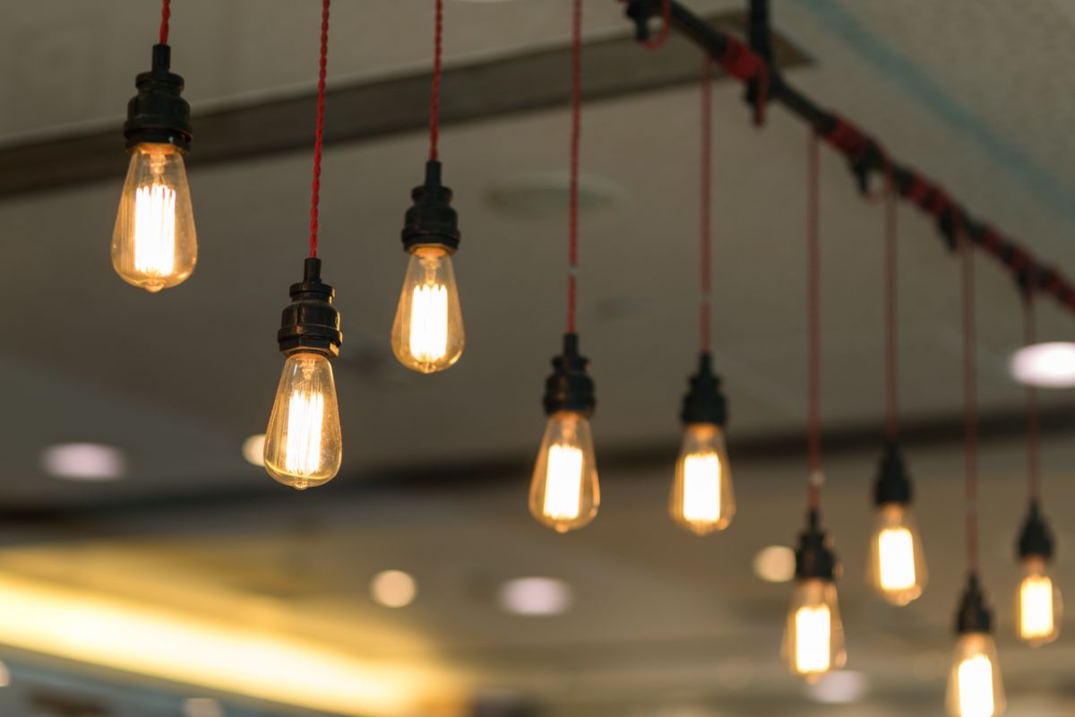
Although, it certainly pays to choose minimal designs when pairing them up, as extravagant lights together may overwhelm the space. The more lights you go for, the more paired back the design should be. Something like these DLLT pendants would be fantastic above a table, as would these Edison-esque pendants given the surroundings were of a similar style.
3. The Avant-Garde Sconce
Usually, sconces are installed as pairs or in greater even numbers for symmetry’s sake, but if you only have room for one, or you only need one supplemental fixture, don’t rule them out; you just have to get a little weird.Instead of placing a normal sconce up on the wall on its own, choose something that breaks the mold and draws attention to the fact it’s the only thing on the wall.
Now, as for what constitutes “breaking the mold”, it’s up for debate, but anything that looks sculpture-like is a sure thing, but don’t just choose a weird sconce purely for the sake of its weirdness. You must still consider the ways it marries with the rest of your interior decor. For instance, it could follow the color scheme of a space or perhaps form the missing link in some sort of conceptual cohesion throughout the room.An example, I hear you say? How about this eye-grabbing origami bird? Would it be too much to have two origami birds on your wall? Yes, but one solitary bird? You’re onto something there!
4. Combination Art
It’s easy to think of artwork as a complete entity that makes mere subjects of nearby design elements.
Light, for instance, is typically employed only as a means of accentuating the art’s splendor, but you can also use feature pieces to complement or expand upon the art on your wall.Place a piece of furniture beneath one of your artworks then decorate it with various ornaments, and of course, an intriguing lamp that extends up next to or beyond it, one that shines a light on the art but also seems to enter the discourse posed by it.If you can do this, you’ve departed the realm of average Joe interior design and entered an entirely new, more conceptual and artistic world; however, this won’t work with every piece of art.
For instance, if you’ve got a print of Rembrandt’s The Night Watch, it’d be far too classical and busy to combine with lighting.
More abstract or minimalist art, on the other hand, is prime for a bit of reconceptualization.
5. An Unlikely Pairing
If your room doesn’t have a traditional overhead, a common solution is to install a custom sequence of recessed lighting, which is a great idea, but it’s been done to dust at this point.
So, to keep things fresh, I’d recommend splitting the lighting burden of the room between recessed and pendant lights.For instance, for every two rows of recessed lights, there could be a row of pendant lights or vice versa.
It’s a bold look that can work wonders in a modern space, but it’s quite hard to get right, so be sure to really think it through before choosing this option.
6. Fireplace Embellishments
Even bricked-in fireplaces remain points of interest, architecturally speaking, so it’ll be worth your while using lighting to emphasize this historical aspect of your room, but stick with the classic aesthetic.Candles and a modern slant on a candelabra may actually be your best bet here, and by placing a mirror behind them, you can reflect their backwards-reaching glow back into the room for extra warmth.
7. Don’t Forget Your Corners
Traditional overheads can look phenomenal, especially if you find one with a finish or style that matches other design elements in the room, but they have one major weakness… shadowy corners!As they’re typically positioned dead center of the ceiling, they fail to banish every dark spot, with shadows all gathering in the far-flung corners of the room, but rather than a problem, I’d view this as an opportunity.Now you can invest in some gorgeous lamps to illuminate your dark peripheries and add new physical and ephemeral dimensions to the space, which inevitably makes it a much nicer environment to be in.If you have furniture in your shadow corners, you’ll need a lovely table lamp, and if you’ve got a bare corner, you can bring a stunning floor lamp into the fold.
Generally speaking, the further away these corners are from the most occupied area of the room, the more extravagant you can be with the design, but don’t hesitate to choose something bold and position it closer to the action.
As long as it complements the room, it’s all good!
8. Super Size It!
Large rooms always pose something of a dilemma when it comes to lighting, particularly if they’re an open-plan space linking multiple rooms with different purposes. A common solution is to install multiple overheads or recessed lights, but another rather striking idea I’ve come across is placing a single oversized pendant above the task-oriented zone, and supplementing it with smaller fixtures around the perimeter of the room.It makes for a surprisingly elegant look, but it’s best to keep the design fairly spare. You don’t want a large, garish pendant, as that will draw too much attention. Instead, choose something quite plain and let its size do the talking.This way, you have a lot more leeway to get bold and eclectic with your wall colors and furniture.
9. Gone Fishin’
For incredibly high cathedral ceilings, it’s not unheard of for people to throw the idea of an overhead out altogether, choosing to use the walls as a base for illumination instead, but there is one original and devilishly stylish way to tackle such a structure.A rather simple, low-hanging light that hovers a mere meter above a central table makes use of all that empty space above your heads and gives the room a fun dynamic.
This is the one occasion in which I wouldn’t care about keeping the cable of a light tucked neatly away, as the more you have on show, the more of a statement it will make.With so much open air in the upper portions of the room, it doesn’t matter how much mess you create up there, so instead of running the cable flush to the ceiling or walls, I’d recommend using some hooks and draping the cable across the open space to create a fishing line look.
10. Accentuate Your Nooks
If you’ve got any reading nooks or little alcoves in your home, they risk gathering shadows, which is a shame, as these are intriguing architectural features.
But, rather than blast them with light, it’s best to use subtle accent lights to add an enticing glow that sets it apart from the rest of the room.You might even go for a subtle colored bulb to really make your alcove pop!
Final Thoughts
Lighting an interior effectively is challenging, but it can also be incredibly fun, so don’t be afraid to experiment and let your creative side take the wheel.
Sometimes it’s a matter of trial and error, but stick with it. Remember what we discussed here today, and you’re sure to find the perfect combination of lights for your living space.


