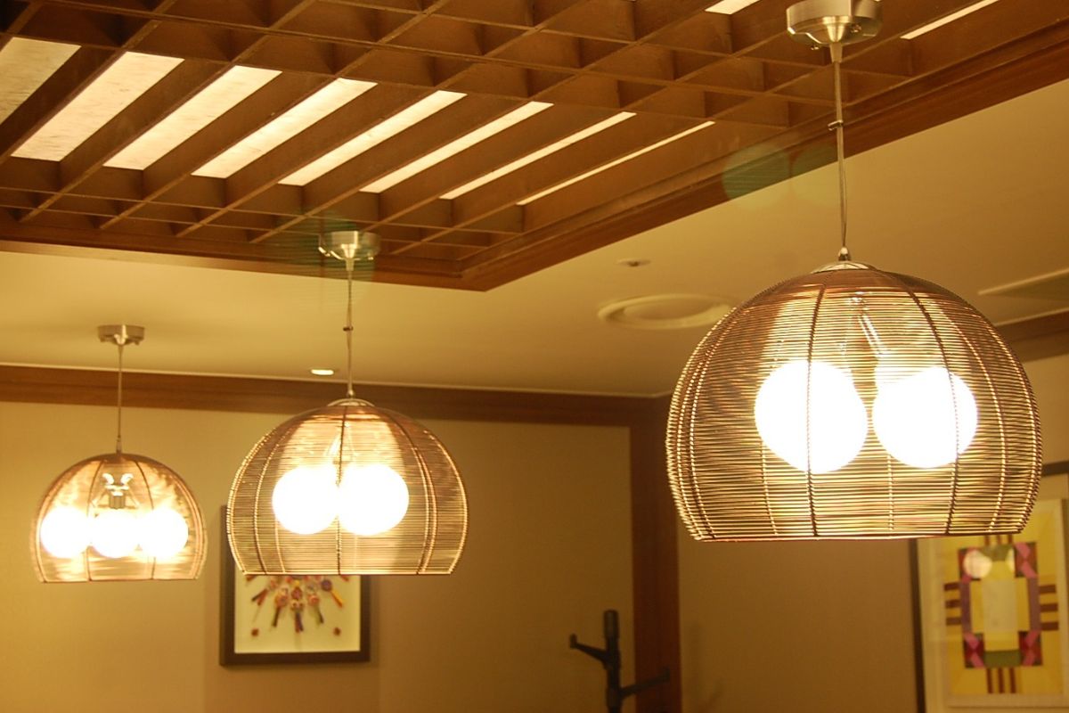
Although the living room is typically the prime location for some ornate hanging overheads, if you’re going for more of a sleek, modern aesthetic or perhaps you live in an older build with particularly low ceilings, recessed lighting is probably your best bet.

The question is, though, where should you place them? Simply installing one where a traditional overhead would hang won’t be of much use at all, which means you have to be a little more hands-on with the implementation of this kind of light.
Don’t worry if you’re drawing a blank because I’m going to be giving you some pro tips on the placement of recessed lighting in living rooms, starting with a shortcoming of this much-loved modern fixture.
Ambiance Factor: The Drawback Of Recessed Lighting
Unfortunately, recessed lights aren’t always the best for providing a nice ambient glow, as typically speaking, they don’t have a wide enough spread, so it’s important that you pair them with supplemental fixtures with mood-setting capabilities.
My go-to for this is a wide array of beautiful lamps that can bring both a softer illumination to the room and some ornate decadence you’re otherwise omitting when you remove traditional overheads from the equation.
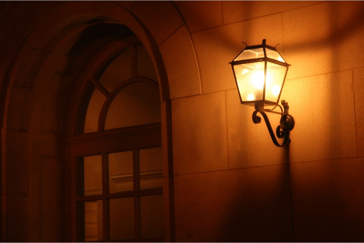
That said, depending on the size and shape of your living room, lamps may not be enough, which is why I’d suggest at least two traditional wall fixtures in the most occupied zone of the space.
These combined with the lamps will get you that lovely, soothing ambiance for movie nights or just winding down with a glass of wine after a hard day’s work.
Living Room Recessed Lighting Layout
There are a number of things to consider when mapping out your own little constellation of recessed lights in your living room.
Perimeter Lighting
Many designers claim that placing recessed lights around the perimeter of the room is a fairly standard starting point of your installation plan, and in many cases, this is true, but there are some shortcomings to this approach when it comes to living rooms.
First, if you have your sofa against a wall, installing lights around the perimeter of the room will mean that some of them are directly above you when you’re trying to relax. Not only can this be quite jarring, it will also create incredibly unappealing shadows.
So, perimeter lighting? Good! Perimeter lighting when your sofa is against the wall? Bad!
Spacing From the Wall
Whether you’re choosing the perimeter method as a foundational approach to your lighting layout or not, you’re going to have at least a few recessed lights near one or more of your walls, but getting too close to your vertical structures and you may cause some problems.
When your recessed lights are cozying up to your wall a little too much, they create a scalloping effect with some pretty garish shadows, which is the opposite effect you want your lighting to have.
As a bare minimum, I’d recommend installing lights 1.5 feet from the wall, but depending on the beam width of the lights in question, you may want to bump that up to 2 or 3 feet.
Don’t Neglect Corners
It’s easy to forget about the corners of our room when mapping out recessed lighting networks, but it’s essential we give these far-flung areas plenty of illumination, since dark corners can make our ceilings appear a lot lower than they are.
Heavy Foot Traffic Zones
Another good way to start your planning is to think about your primary path of travel through the room.
Of course, you want a balanced, symmetrical layout, so you shouldn’t put more lights over heavy foot traffic areas of your living room, but by ensuring a row of lights is stationed directly over this spot, you can space out the rest of your lights accordingly.
This way, you attain that symmetry you’re craving while also keeping your path well-lit.
Spacing Your Central Lights
There are two rules of thumb you can use to help with recessed light spacing in your living room.
- Rule #1: Measure the distance from your floor to your ceiling, divide it by two, and that’s how far each light should be from surrounding fixtures.
- Rule #2: Measure the distance between the wall and your first recessed light, double it, and that’s how far each light should be from surrounding fixtures.
My advice is to contemplate both approaches and try to picture how they’d work in your living room. If one approach causes spatial issues due to the dimensions of your room, go for the other rule.
Pay Mind to the Spread of Your Bulbs
Not that you should disregard the formulae we just spoke about, but before you go with a general approach, you should consider the spread of your bulbs.
You want your light to be far enough apart that there’s no distinct beam overlap, and you want them to be close enough that there are no significant dark areas.
Don’t “Overlight”
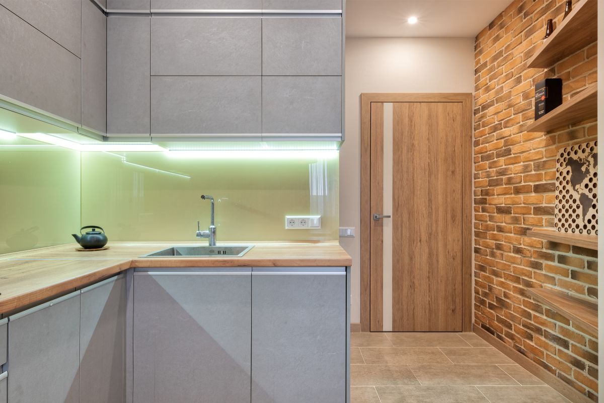
Generally speaking, living rooms aren’t operational zones, by which I mean they’re primarily used for relaxation, so it’s important to take a less is more approach, otherwise you’ll end up with an overly sterile lighting aesthetic better suited to your kitchen or bathroom.
TV Troubles
There’s nothing worse than glare on your TV when you’re trying to enjoy your leisure time, and one of the benefits of designing your own recessed light layout is that you can eliminate this issue.
If you’ve got a free-standing TV, the trick is to position a recessed light just behind it and the next in sequence as far in front of it as possible. For wall-mounted TVs, your best bet is to leave at least 3 feet between the wall and your first light.
Sketch Out Your Plan
If you take anything from this guide, it’s that you should always sketch out your ideas before breaking ground (or ceiling as the case is here), as there’s no going back once you begin installation.
Final Thoughts
Okay, so we’ve gone over some recessed lighting essentials for living rooms here today, but in my own personal experience, it’s always best to consult a lighting expert at least once to see if your plans are up to par.
Everybody’s living room is different, so using cookie-cutter generalities isn’t always going to work. Use what you’ve learned here as a starting point, but don’t be afraid to elaborate your plan to suit your living space.


